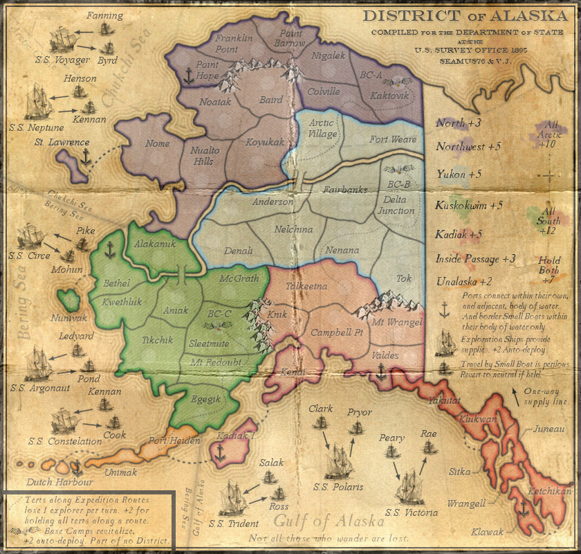
in case i haven't mentioned it, i particularly like the fact that there are only 7 ports, so that players have to fight for them in an 8-player singles game.
ian.
Moderator: Cartographers
![]() by iancanton on Wed Jul 10, 2013 4:14 pm
by iancanton on Wed Jul 10, 2013 4:14 pm


![]() by Seamus76 on Wed Jul 10, 2013 5:50 pm
by Seamus76 on Wed Jul 10, 2013 5:50 pm


![]() by Bruceswar on Wed Jul 10, 2013 6:07 pm
by Bruceswar on Wed Jul 10, 2013 6:07 pm


![]() by dolomite13 on Wed Jul 10, 2013 6:32 pm
by dolomite13 on Wed Jul 10, 2013 6:32 pm
Bruceswar wrote:Then if you do not plan to use the grid like an original map would have take out the survey part in the title?


![]() by Aleena on Wed Jul 10, 2013 8:01 pm
by Aleena on Wed Jul 10, 2013 8:01 pm


![]() by Seamus76 on Wed Jul 10, 2013 8:25 pm
by Seamus76 on Wed Jul 10, 2013 8:25 pm
Nah, there are different types of "survey" maps, with and without grid lines. The map I stole that text from, as you can see, doesn't have grid lines. It's a big map, but if you look at the bottom right text you can see.Bruceswar wrote:Then if you do not plan to use the grid like an original map would have take out the survey part in the title?
![]() by iancanton on Sat Jul 13, 2013 12:56 am
by iancanton on Sat Jul 13, 2013 12:56 am
Seamus76 wrote:it's been a long sticky.

![]() by koontz1973 on Tue Jul 16, 2013 11:23 am
by koontz1973 on Tue Jul 16, 2013 11:23 am


![]() by Seamus76 on Tue Jul 16, 2013 11:45 am
by Seamus76 on Tue Jul 16, 2013 11:45 am
Thanks koontz. I did try some fill, which I initially didn't like, but I think it's just a matter of getting the opacity right. I'm working on it now.koontz1973 wrote:Seamus, mountains, a bit of fill in colour would not go amiss. Also, can you look at distressing the edges a bit. The map looks like a replica of an old map as it is now.
![]() by dolomite13 on Tue Jul 16, 2013 12:06 pm
by dolomite13 on Tue Jul 16, 2013 12:06 pm
![]() by Seamus76 on Tue Jul 16, 2013 12:18 pm
by Seamus76 on Tue Jul 16, 2013 12:18 pm
Unfortunately I use gimp, but it looked like a lot of the stuff was blending modes, and burn/dodge, etc. which I can probably replicate in gimp with a little playing around. If anyone has any gimp specific stuff that would be great as well.dolomite13 wrote:There are some interesting techniques on this site for making thinks look old or slightly worn. You might be able to apply one of these techniques to the edges of the map to make it look a bit worn. Provided you use photoshop.
http://www.smashingmagazine.com/2008/10 ... tutorials/
=D13=
![]() by koontz1973 on Tue Jul 16, 2013 12:24 pm
by koontz1973 on Tue Jul 16, 2013 12:24 pm
![]() by Aleena on Tue Jul 16, 2013 12:53 pm
by Aleena on Tue Jul 16, 2013 12:53 pm
![]() by Seamus76 on Tue Jul 16, 2013 1:03 pm
by Seamus76 on Tue Jul 16, 2013 1:03 pm
You make me laugh, I'm glad you're here Aleena. And I agree with you to a point, but to be fair, I understand what koontz is saying as well, and more so, he has never steered me wrong with a suggestion. Look at Three Kingdoms of China, with out his pushing I wouldn't have added that really nice paper background. Which did make the map look a lot better. I pushed back over and over saying, the same thing, that I didn't want to grunge it up, that I liked it pretty, etc. But in the end it does look better, there is no arguing with that.Aleena wrote:Guess Kootz1973 does not like new and shiny - - spilled coffee on the map - I can imagine how he keeps his desk organized..
I think it is a good, clean map - I think sometimes less is more...
Anything else might clutter up the map or change someone's focus off the map and onto the mess...
![]() by dolomite13 on Tue Jul 16, 2013 1:34 pm
by dolomite13 on Tue Jul 16, 2013 1:34 pm
![]() by koontz1973 on Tue Jul 16, 2013 11:31 pm
by koontz1973 on Tue Jul 16, 2013 11:31 pm
Seamus76 wrote:You make me laugh, I'm glad you're here Aleena. And I agree with you to a point, but to be fair, I understand what koontz is saying as well, and more so, he has never steered me wrong with a suggestion. Look at Three Kingdoms of China, with out his pushing I wouldn't have added that really nice paper background. Which did make the map look a lot better. I pushed back over and over saying, the same thing, that I didn't want to grunge it up, that I liked it pretty, etc. But in the end it does look better, there is no arguing with that.Aleena wrote:Guess Kootz1973 does not like new and shiny - - spilled coffee on the map - I can imagine how he keeps his desk organized..
I think it is a good, clean map - I think sometimes less is more...
Anything else might clutter up the map or change someone's focus off the map and onto the mess...
Ultimately it's my call, but koontz helps me see the other side of things, and how it will look to the masses.
![]() by Seamus76 on Wed Jul 17, 2013 12:28 pm
by Seamus76 on Wed Jul 17, 2013 12:28 pm
![]() by koontz1973 on Wed Jul 17, 2013 12:45 pm
by koontz1973 on Wed Jul 17, 2013 12:45 pm
![]() by Seamus76 on Wed Jul 17, 2013 12:55 pm
by Seamus76 on Wed Jul 17, 2013 12:55 pm
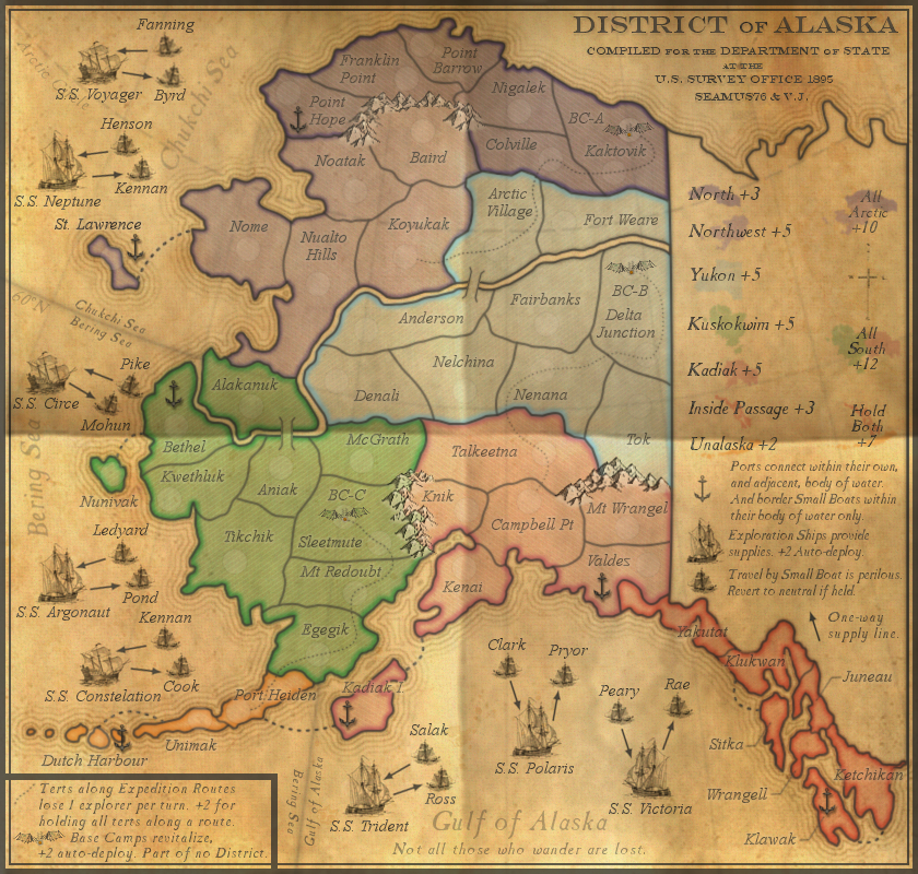
koontz1973 wrote:Seamus, that is exactly the same crease as you put into China. Get rid of it as it is. It works for China because of the rougher paper, this one does not. The map looks newer so the crease needs to be newer. Sharper and more defined. Also, 4 panels instead of the 6 you have now. If you cannot get that, then I would say to remove it completely and try to find a way to roll the paper as I see you have some added text in the top corner. US state dept would of rolled maps and not folded them.
As for the mountains, I think that works really well. Maybe a slightly more grey tone but I can easily live with them as they are now.
![]() by koontz1973 on Wed Jul 17, 2013 1:04 pm
by koontz1973 on Wed Jul 17, 2013 1:04 pm
![]() by dolomite13 on Wed Jul 17, 2013 1:31 pm
by dolomite13 on Wed Jul 17, 2013 1:31 pm
![]() by Seamus76 on Wed Jul 17, 2013 1:33 pm
by Seamus76 on Wed Jul 17, 2013 1:33 pm
![]() by Bruceswar on Wed Jul 17, 2013 6:56 pm
by Bruceswar on Wed Jul 17, 2013 6:56 pm
![]() by cairnswk on Wed Jul 17, 2013 9:03 pm
by cairnswk on Wed Jul 17, 2013 9:03 pm
Bruceswar wrote:I agree.... dump the crease... adds nothing to this map... Looked better without it


![]() by koontz1973 on Wed Jul 17, 2013 10:24 pm
by koontz1973 on Wed Jul 17, 2013 10:24 pm
cairnswk wrote:Bruceswar wrote:I agree.... dump the crease... adds nothing to this map... Looked better without it
Agreed
Users browsing this forum: No registered users
|
|||||||
| Conquer Club is not associated with RISK online in any way. Copyright © 2006-2025 by Big Wham LLC | |||||||