
Quad Cities Map [Quenched]
Moderator: Cartographers
Re: Quad Cities Map
![]() by Evil DIMwit on Tue Dec 14, 2010 12:18 am
by Evil DIMwit on Tue Dec 14, 2010 12:18 am
No comments? Good. Looks like a promotion here.


-

 Evil DIMwit
- Posts: 1616
- Joined: Thu Mar 22, 2007 1:47 pm
- Location: Philadelphia, NJ


Re: Quad Cities Map
![]() by Victor Sullivan on Tue Dec 14, 2010 6:47 am
by Victor Sullivan on Tue Dec 14, 2010 6:47 am
 Very nice.
Beckytheblondie: "Don't give us the dispatch, give us a mustache ride."
Scaling back on my CC involvement...
Scaling back on my CC involvement...
-

Victor Sullivan
- Posts: 6010
- Joined: Mon Feb 08, 2010 8:17 pm
- Location: Columbus, OH


Re: Quad Cities Map
![]() by ironsij0287 on Wed Dec 15, 2010 10:15 am
by ironsij0287 on Wed Dec 15, 2010 10:15 am
Onto Graphics. I would imagine there'll be some comments/suggestions here.
-

ironsij0287
- Posts: 379
- Joined: Tue Nov 09, 2010 2:30 pm
- Location: Dubuque


Re: Quad Cities Map
![]() by Victor Sullivan on Wed Dec 15, 2010 1:19 pm
by Victor Sullivan on Wed Dec 15, 2010 1:19 pm
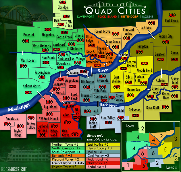
My only quibble is the boxes that have the names of the bonus areas are just not quick-reference friendly, nor does it look aesthetically splendid. Honestly, I'm not really sure what a good alternative would be, though.
Beckytheblondie: "Don't give us the dispatch, give us a mustache ride."
Scaling back on my CC involvement...
Scaling back on my CC involvement...
-
Victor Sullivan
- Posts: 6010
- Joined: Mon Feb 08, 2010 8:17 pm
- Location: Columbus, OH
Re: Quad Cities Map
![]() by ironsij0287 on Wed Dec 15, 2010 3:41 pm
by ironsij0287 on Wed Dec 15, 2010 3:41 pm
Victor Sullivan wrote:My only quibble is the boxes that have the names of the bonus areas are just not quick-reference friendly, nor does it look aesthetically splendid. Honestly, I'm not really sure what a good alternative would be, though.
Yeah. But I do at least have the bonus numbers on the small map to accompany them.
-
ironsij0287
- Posts: 379
- Joined: Tue Nov 09, 2010 2:30 pm
- Location: Dubuque
Re: Quad Cities Map
![]() by ironsij0287 on Wed Dec 15, 2010 3:43 pm
by ironsij0287 on Wed Dec 15, 2010 3:43 pm
Would troop number circles or whatever you call them be a good idea? I'm thinking in some of the regions it might help a little.
-
ironsij0287
- Posts: 379
- Joined: Tue Nov 09, 2010 2:30 pm
- Location: Dubuque
Re: Quad Cities Map
![]() by MrBenn on Wed Dec 15, 2010 3:53 pm
by MrBenn on Wed Dec 15, 2010 3:53 pm
This is a very good-looking map - it's good to see somebody with a good attitude too 
I'll have a more in-depth look later, and have some thoughts about how to take it from good to great
I'll have a more in-depth look later, and have some thoughts about how to take it from good to great

PB: 2661 | He's blue... If he were green he would die | No mod would be stupid enough to do that
-

MrBenn
- Posts: 6880
- Joined: Wed Nov 21, 2007 9:32 am
- Location: Off Duty


Re: Quad Cities Map
![]() by AndyDufresne on Wed Dec 15, 2010 4:06 pm
by AndyDufresne on Wed Dec 15, 2010 4:06 pm
For the graphics, where do you want to see this map go, ironsij? Is your intent to develop it more into what looks like a tabletop foldable map? A brochure map for the area? Or something with that sort of theme? (Indian Empire, High Seas, Route 66, etc) Or more a simply crafted map with minimal aesthetics (Australia, Charelston, Greenland, etc).
--Andy
--Andy
-

AndyDufresne
- Posts: 24935
- Joined: Fri Mar 03, 2006 8:22 pm
- Location: A Banana Palm in Zihuatanejo


Re: Quad Cities Map
![]() by ironsij0287 on Tue Dec 21, 2010 2:40 pm
by ironsij0287 on Tue Dec 21, 2010 2:40 pm
Probably the latter with minimal aesthetics. I used up so much space with the territories and labels that trying to add any additional effects to the map in my opinion would really muddy it up.
-
ironsij0287
- Posts: 379
- Joined: Tue Nov 09, 2010 2:30 pm
- Location: Dubuque
Re: Quad Cities Map
![]() by thenobodies80 on Tue Jan 04, 2011 2:43 pm
by thenobodies80 on Tue Jan 04, 2011 2:43 pm
You could try to add a sort of image to your background, maybe something related with the zone the map shows or just a texture instead of using that green background because your map looks like it's floating on a strange green substance.
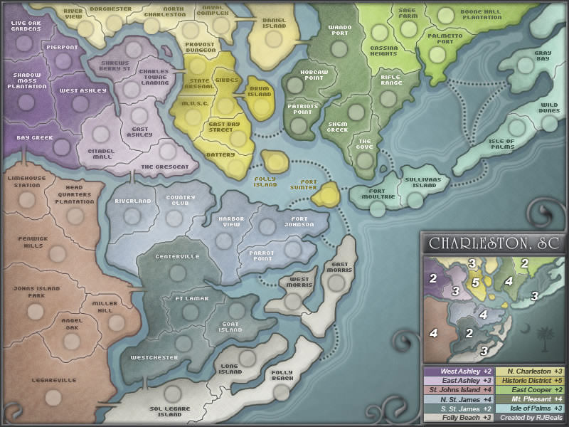
You could also work a bit on river, the water can be improved a bit to look a bit less flat (charleston map is a good example) and the river edges should have softer changes of directions, less "angular".
Did you try to draw thinner creek where they start?
A question, probably a stupid one since the first time i read your map title i thought about one of this , but because there's that empty space between the Mississippi, Big Island and Turkey Hollow?
Isn't rivers and creeks redundant? I think that something like rivers are only passable by bridge is enough. or not?
Your signature is hard to read imo.
Swap the position of armies and name in Campbell.
I tested the map on vischeck, the colors look fine and your good minimap is a nice addition.
Could you please post a version with yellow and orange 888 on the zones with the same colors? I don't think there will be problems since numbers have a black outline, but just to be sure...
On the whole it's a nice map, you're on the right way!
Nobodies
You could also work a bit on river, the water can be improved a bit to look a bit less flat (charleston map is a good example) and the river edges should have softer changes of directions, less "angular".
Did you try to draw thinner creek where they start?
A question, probably a stupid one since the first time i read your map title i thought about one of this
Isn't rivers and creeks redundant? I think that something like rivers are only passable by bridge is enough. or not?
Your signature is hard to read imo.
Swap the position of armies and name in Campbell.
I tested the map on vischeck, the colors look fine and your good minimap is a nice addition.
Could you please post a version with yellow and orange 888 on the zones with the same colors? I don't think there will be problems since numbers have a black outline, but just to be sure...
On the whole it's a nice map, you're on the right way!
Nobodies
-

thenobodies80
- Posts: 5400
- Joined: Wed Sep 05, 2007 4:30 am
- Location: Milan


Re: Quad Cities Map
![]() by ironsij0287 on Thu Jan 06, 2011 10:34 am
by ironsij0287 on Thu Jan 06, 2011 10:34 am
thenobodies80 wrote:You could try to add a sort of image to your background, maybe something related with the zone the map shows or just a texture instead of using that green background because your map looks like it's floating on a strange green substance.
You could also work a bit on river, the water can be improved a bit to look a bit less flat (charleston map is a good example) and the river edges should have softer changes of directions, less "angular".
Did you try to draw thinner creek where they start?
A question, probably a stupid one since the first time i read your map title i thought about one of this
Isn't rivers and creeks redundant? I think that something like rivers are only passable by bridge is enough. or not?
Your signature is hard to read imo.
Swap the position of armies and name in Campbell.
I tested the map on vischeck, the colors look fine and your good minimap is a nice addition.
Could you please post a version with yellow and orange 888 on the zones with the same colors? I don't think there will be problems since numbers have a black outline, but just to be sure...
On the whole it's a nice map, you're on the right way!
Nobodies
I really appreciate the input. I'll work on some of this over the weekend. Thanks!
-
ironsij0287
- Posts: 379
- Joined: Tue Nov 09, 2010 2:30 pm
- Location: Dubuque
Re: Quad Cities Map
![]() by jefjef on Sun Jan 16, 2011 2:43 pm
by jefjef on Sun Jan 16, 2011 2:43 pm
Wow. Can't believe I hadn't seen this until now. Nice. Looking forward to conquering the QCA!
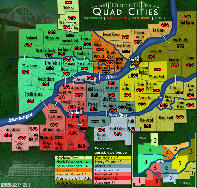
The region you are referring to as Nahant Swamp is generally known to the natives/locals as "West End" or "West River Drive" or "Garden Addition". Although a part of the Garden you have in the Rockingham tert. No one I know refers to that area as Nahant Swamp. Guess that is a realtor name for it, like Probstie. (Which is a small 2 pool table - 12 chair bar at the entrance of a Trailer park just before I-280)
Just to the west of the "Nahant" tert (Across the river from Andalusia) is Buffalo, Which in all realty is as much a part of the QCA as Andalusia or Eldridge.
Arsenal should be titled R.I. Arsenal. (Rock Island Arsenal)
I have never heard of Longview tert of Rock Island referred to anything but Downtown R. I.
Ridgeview Park is always just "RidgeView" to the locals.
Just wanted ya to hear from a local.
Keep up the good work!
This post was made by jefjef who should be on your ignore list.

drunkmonkey wrote:I'm filing a C&A report right now. Its nice because they have a drop-down for "jefjef".
-

jefjef
- Posts: 6026
- Joined: Mon Feb 23, 2009 8:41 pm
- Location: on my ass


Re: Quad Cities Map
![]() by ironsij0287 on Sun Jan 16, 2011 4:02 pm
by ironsij0287 on Sun Jan 16, 2011 4:02 pm
jefjef wrote:Wow. Can't believe I hadn't seen this until now. Nice. Looking forward to conquering the QCA!
The region you are referring to as Nahant Swamp is generally known to the natives/locals as "West End" or "West River Drive" or "Garden Addition". Although a part of the Garden you have in the Rockingham tert. No one I know refers to that area as Nahant Swamp. Guess that is a realtor name for it, like Probstie. (Which is a small 2 pool table - 12 chair bar at the entrance of a Trailer park just before I-280)
Just to the west of the "Nahant" tert (Across the river from Andalusia) is Buffalo, Which in all realty is as much a part of the QCA as Andalusia or Eldridge.
Arsenal should be titled R.I. Arsenal. (Rock Island Arsenal)
I have never heard of Longview tert of Rock Island referred to anything but Downtown R. I.
Ridgeview Park is always just "RidgeView" to the locals.
Just wanted ya to hear from a local.
Keep up the good work!
Yeah the naming of the regions had to be a little more generalized given the entire area it covered.
Originally I had Buffalo on the map as part of another group of territories including Blue Grass and Walcott as well, but due to space constraints I opted to cut them from the map. Andalusia was added later to offer a small bonus region on the Illinois side to counter Eldridge.
I lived in Rock Island for four years. I tried my best to keep the geographical integrity of the regions but some liberties had to be taken for the sake of the game board.
-
ironsij0287
- Posts: 379
- Joined: Tue Nov 09, 2010 2:30 pm
- Location: Dubuque
Re: Quad Cities Map
![]() by Joodoo on Mon Jan 17, 2011 1:26 am
by Joodoo on Mon Jan 17, 2011 1:26 am
"Arsenal" looks pretty lonely out on its on bonus zone. Would it be possible if you could make it a starter neutral and autodeploy if a player captures it?
TheSaxlad wrote:The Dice suck a lot of the time.
And if they dont suck then they blow.
-

Joodoo
- Posts: 1639
- Joined: Fri Mar 21, 2008 12:19 am
- Location: Greater Toronto, Canada
Re: Quad Cities Map
![]() by AndyDufresne on Mon Jan 17, 2011 1:05 pm
by AndyDufresne on Mon Jan 17, 2011 1:05 pm
Joodoo wrote:"Arsenal" looks pretty lonely out on its on bonus zone. Would it be possible if you could make it a starter neutral and autodeploy if a player captures it?
I've always preferred to see gameplay 'fixes' that aren't hard coded-always neutral regions.
--Andy
-
AndyDufresne
- Posts: 24935
- Joined: Fri Mar 03, 2006 8:22 pm
- Location: A Banana Palm in Zihuatanejo
Re: Quad Cities Map
![]() by Industrial Helix on Tue Jan 18, 2011 12:51 pm
by Industrial Helix on Tue Jan 18, 2011 12:51 pm
Hmm... I see nobodies already mentioned Charleston. I think its a good map that you should be able to draw some inspiration from. A little bit of texture on the map wouldn't muddy things in my opinion.
Sketchblog [Update 07/25/11]: http://indyhelixsketch.blogspot.com/
Living in Japan [Update 07/17/11]: http://mirrorcountryih.blogspot.com/
Russian Revolution map for ConquerClub [07/20/11]: viewtopic.php?f=241&t=116575
Living in Japan [Update 07/17/11]: http://mirrorcountryih.blogspot.com/
Russian Revolution map for ConquerClub [07/20/11]: viewtopic.php?f=241&t=116575
-

Industrial Helix
- Posts: 3462
- Joined: Mon Jul 14, 2008 6:49 pm
- Location: Ohio


Re: Quad Cities Map
![]() by ironsij0287 on Tue Jan 18, 2011 2:36 pm
by ironsij0287 on Tue Jan 18, 2011 2:36 pm
I planned on having Arsenal always start as a Neutral 3 and the zone would be an autodeploy +1 bonus when held. Kind of like New Westminster on the Vancouver game.
-
ironsij0287
- Posts: 379
- Joined: Tue Nov 09, 2010 2:30 pm
- Location: Dubuque
Re: Quad Cities Map
![]() by RedBaron0 on Sun Jan 23, 2011 1:57 am
by RedBaron0 on Sun Jan 23, 2011 1:57 am
I agree with Helix, a bit of land texture would do well here.
Have you tried different colors for the text? Black is ok, but a few spots where you've tried to add extra glow for readability actually makes it worse. Try white with a black glow or shadow, see if it comes out any better.
The red in Blackhawk is pretty much the same color as the army numbers for red, tweak that bonus region's color a bit, and take a look at vischeck and make sure you're good with the those with colorblindness. http://www.vischeck.com/vischeck/vischeckImage.php


-

RedBaron0
- Posts: 2657
- Joined: Sun Aug 19, 2007 12:59 pm
- Location: Pennsylvania


Re: Quad Cities Map
![]() by Industrial Helix on Thu Jan 27, 2011 9:07 am
by Industrial Helix on Thu Jan 27, 2011 9:07 am
Yeah, that texture does a lot for the map. Big improvement.
The thing that really bugs me is the deep jungle green background. It reminds me of the Brazil map or the rainforest in its tone. I imagine the area is quite green, so I see why you chose it, but I think a warmer green might do better. Either straight up green or perhaps an autumn green. Test things out, see which fits.
The thing that really bugs me is the deep jungle green background. It reminds me of the Brazil map or the rainforest in its tone. I imagine the area is quite green, so I see why you chose it, but I think a warmer green might do better. Either straight up green or perhaps an autumn green. Test things out, see which fits.
Sketchblog [Update 07/25/11]: http://indyhelixsketch.blogspot.com/
Living in Japan [Update 07/17/11]: http://mirrorcountryih.blogspot.com/
Russian Revolution map for ConquerClub [07/20/11]: viewtopic.php?f=241&t=116575
Living in Japan [Update 07/17/11]: http://mirrorcountryih.blogspot.com/
Russian Revolution map for ConquerClub [07/20/11]: viewtopic.php?f=241&t=116575
-
Industrial Helix
- Posts: 3462
- Joined: Mon Jul 14, 2008 6:49 pm
- Location: Ohio
Re: Quad Cities Map
![]() by ironsij0287 on Thu Jan 27, 2011 2:54 pm
by ironsij0287 on Thu Jan 27, 2011 2:54 pm
Industrial Helix wrote:Yeah, that texture does a lot for the map. Big improvement.
The thing that really bugs me is the deep jungle green background. It reminds me of the Brazil map or the rainforest in its tone. I imagine the area is quite green, so I see why you chose it, but I think a warmer green might do better. Either straight up green or perhaps an autumn green. Test things out, see which fits.
Yeah I can fiddle with the green a bit. I'm happy with how the texture turned out. That's from a digital elevation model of that area so it's true to the region's topography too.
-
ironsij0287
- Posts: 379
- Joined: Tue Nov 09, 2010 2:30 pm
- Location: Dubuque
Re: Quad Cities Map
![]() by pamoa on Fri Jan 28, 2011 6:14 am
by pamoa on Fri Jan 28, 2011 6:14 am
yeah great move with this bg
maybe can you remove the shadow under territories and river
maybe can you remove the shadow under territories and river
De gueules à la tour d'argent ouverte, crénelée de trois pièces, sommée d'un donjon ajouré, crénelé de deux pièces
Gules an open tower silver, crenellated three parts, topped by a apertured turret, crenellated two parts
Gules an open tower silver, crenellated three parts, topped by a apertured turret, crenellated two parts
-

pamoa
- Posts: 1242
- Joined: Sat Sep 01, 2007 3:18 am
- Location: Confederatio Helvetica


Re: Quad Cities Map
![]() by AndyDufresne on Fri Jan 28, 2011 10:59 am
by AndyDufresne on Fri Jan 28, 2011 10:59 am
Is it worthwhile to add some sort of more well defined line/barrier around the regions that touch the non-playable area? I.E. the whole perimeter of the gameboard.
--Andy
--Andy
-
AndyDufresne
- Posts: 24935
- Joined: Fri Mar 03, 2006 8:22 pm
- Location: A Banana Palm in Zihuatanejo
Re: Quad Cities Map
![]() by ironsij0287 on Fri Jan 28, 2011 3:20 pm
by ironsij0287 on Fri Jan 28, 2011 3:20 pm
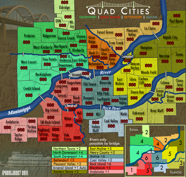
I went a little different route and made the background a muted brown. I think it makes the colors of the regions come out more.
-
ironsij0287
- Posts: 379
- Joined: Tue Nov 09, 2010 2:30 pm
- Location: Dubuque
Who is online
Users browsing this forum: No registered users
|
|||||||
| Conquer Club is not associated with RISK online in any way. Copyright © 2006-2025 by Big Wham LLC | |||||||