Japan - 日本 - Quenched
Moderator: Cartographers
Re: Japan - 日本 (D, Gp) V9.6 (Upd 11-14)pg29 Working on Graphics
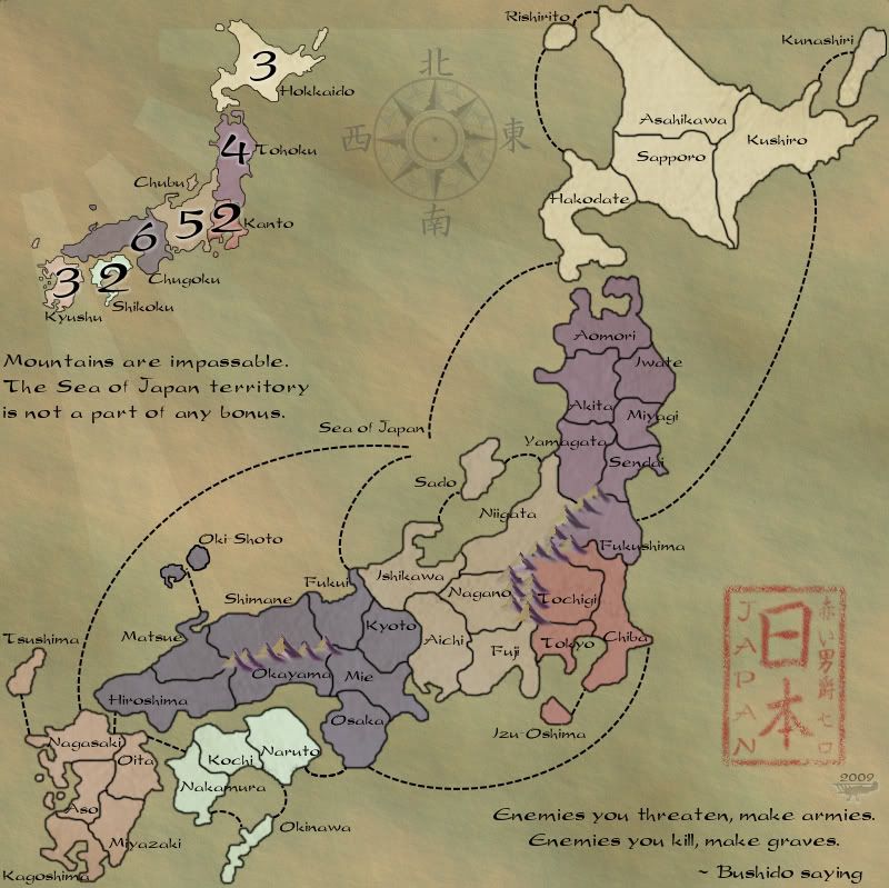
The font of the territory names looks a bit odd... it's like the o:s and the s:s are from a different font than the other letters... look at, for example, Hiroshima... it looks like "HirOShima"...

-

 natty dread
- Posts: 12877
- Joined: Fri Feb 08, 2008 8:58 pm
- Location: just plain fucked


Re: Japan - 日本 (D, Gp) V9.6 (Upd 11-14)pg29 Working on Graphics
Might be part of the transfer, I'll likely try a version that's a .png see if that's any better.


-

 RedBaron0
- Posts: 2657
- Joined: Sun Aug 19, 2007 12:59 pm
- Location: Pennsylvania


Re: Japan - 日本 (D, Gp) V9.6 (Upd 11-14)pg29 Working on Graphics
the.killing.44 wrote:Sea line connectors
EDIT Ignore that last statement.... NOW I get it, and you're so right 44, thanks!


-

 RedBaron0
- Posts: 2657
- Joined: Sun Aug 19, 2007 12:59 pm
- Location: Pennsylvania


Re: Japan - 日本 (D, Gp) V9.6 (Upd 11-14)pg29 Working on Graphics
MrBenn wrote:Technically it's a "falling sun" (as the lines come down instead of up), but I think we can let it pass...
Dear heavens, I hope you mean "setting sun" -- a "falling sun" sounds quite apocalyptic!
-

 ender516
- Posts: 4455
- Joined: Wed Dec 17, 2008 6:07 pm
- Location: Waterloo, Ontario


Re: Japan - 日本 (D, Gp) V9.6 (Upd 11-14)pg29 Working on Graphics
yea-yea the sun is in the west 

I also just realized I forgot to reconnect Aomori and Hakodate. I'll hit that as I try and figure out the sea routes. Which is likely the last thing before I get another image posted up.
I also just realized I forgot to reconnect Aomori and Hakodate. I'll hit that as I try and figure out the sea routes. Which is likely the last thing before I get another image posted up.


-

 RedBaron0
- Posts: 2657
- Joined: Sun Aug 19, 2007 12:59 pm
- Location: Pennsylvania


Re: Japan - 日本 (D, Gp) V9.6 (Upd 11-14)pg29 Working on Graphics
RedBaron0 wrote:Might be part of the transfer, I'll likely try a version that's a .png see if that's any better.
I don't think it has a thing to do with the file size. It's just the s's (there's a confusing plural for ya) and o's. It's very odd, you may have to manually play with the settings on those specific letters, if it's not something obvious.
RedBaron0 wrote:the.killing.44 wrote:Sea line connectorsNow all that jitter and stuff makes perfect sense.
EDIT Ignore that last statement.... NOW I get it, and you're so right 44, thanks!
Okay. I hope this is what you understood.
Sea line connectors - too straight and vector-looking. Make them more brush-like.
Japan / Riben / signature - do all that crazy brushwork
Let's see what you got. If it's not what I was trying to explain, send me the merged layer in its own file (you can convert; don't really know how though—ask nobodies or walrus), and I'll send it back with what I think would be good.
-

 the.killing.44
- Posts: 4724
- Joined: Thu Oct 23, 2008 7:43 pm
- Location: now tell me what got two gums and knows how to spit rhymes


Re: Japan - 日本 (D, Gp) V9.6 (Upd 11-14)pg29 Working on Graphics
I think it worked out pretty well. Still working on the sea connections... I downloaded photoshop for just this, free trail. The paths tool is so much different than GIMP's


-

 RedBaron0
- Posts: 2657
- Joined: Sun Aug 19, 2007 12:59 pm
- Location: Pennsylvania


Re: Japan - 日本 (D, Gp) V9.6 (Upd 11-14)pg29 Working on Graphics
Think your way too light on your title stamp. I've owned Japanese silk paintings that had red stamps on them and they were very crisp. Not faint at all.
This post was made by jefjef who should be on your ignore list.


drunkmonkey wrote:I'm filing a C&A report right now. Its nice because they have a drop-down for "jefjef".
-

 jefjef
- Posts: 6026
- Joined: Mon Feb 23, 2009 8:41 pm
- Location: on my ass


Re: Japan - 日本 (D, Gp) V9.6 (Upd 11-14)pg29 Working on Graphics
RedBaron0 wrote:
I think it worked out pretty well. Still working on the sea connections... I downloaded photoshop for just this, free trail. The paths tool is so much different than GIMP'sI think I'll have to try another way anyways. Function trumps form so the lines need to be clearly connecting each territory and achieve this painted on look. I think the text has come out better using photoshop too.(I retyped them) I may have to still think about using an outer glow or drop shadow on the text, very lightly in the spots where the lines cross borders the territory names are getting a bit lost, but not too badly.
Okay damn it. I know I'm a newt to the map world but... I feel like we are taking a step back here. The versions where we were talking about waves and cool Japanese paper looking maps ROCKED and this one... is great, but looks like every other very good map at CC. Maybe I've missed the general shift here but I don't (personally) think this is a step forward. I loved the modern look of versions before this.
Sorry if I am off track on this and ignore me if I am but Red I LOVED the other version better.
Cheers, and thanks for all your hard work here.
E.
-

 elfish_lad
- Posts: 1155
- Joined: Sat Jul 18, 2009 7:49 pm


Re: Japan - 日本 (D, Gp) V9.6 (Upd 11-14)pg29 Working on Graphics
jefjef wrote:Think your way too light on your title stamp. I've owned Japanese silk paintings that had red stamps on them and they were very crisp. Not faint at all.
I tend to agree. I know I said to fade the central characters to match the sides, but this may have gone too far. The important thing is to get an even registration, and upon reflection I think most Japanese artists are way too fussy to allow a faded stamp out of their workshops. It might be best to make it a good solid print.
elfish_lad wrote:Okay damn it. I know I'm a newt to the map world but... I feel like we are taking a step back here. The versions where we were talking about waves and cool Japanese paper looking maps ROCKED and this one... is great, but looks like every other very good map at CC. Maybe I've missed the general shift here but I don't (personally) think this is a step forward. I loved the modern look of versions before this.
Sorry if I am off track on this and ignore me if I am but Red I LOVED the other version better.
Cheers, and thanks for all your hard work here.
E.
I think I have expressed this view before as well. Maybe if we get a few more reviewers in here, we could try a side-by-side comparison of the best of both themes and have a poll to battle it out.
-

 ender516
- Posts: 4455
- Joined: Wed Dec 17, 2008 6:07 pm
- Location: Waterloo, Ontario


Re: Japan - 日本 (D, Gp) V9.6 (Upd 11-14)pg29 Working on Graphics
viewtopic.php?f=468&t=78339&start=270#p2285824
^^ For the paths ^^ I'd do the same thing you did to the block, only much less visible (i.e. cover more area with your mask work).
Oh, and no offense but the old image looked like someone barfed in the form of Japan, colored over it in bright colors, and tried to make it look ancient.
-

 the.killing.44
- Posts: 4724
- Joined: Thu Oct 23, 2008 7:43 pm
- Location: now tell me what got two gums and knows how to spit rhymes


Re: Japan - 日本 (D, Gp) V9.6 (Upd 11-14)pg29 Working on Graphics
the.killing.44 wrote:Oh, and no offense but the old image looked like someone barfed in the form of Japan, colored over it in bright colors, and tried to make it look ancient.
If they covered the barf in bright colours, it doesn't really matter how the form was made, does it? And how did it look ancient at all?
-

 ender516
- Posts: 4455
- Joined: Wed Dec 17, 2008 6:07 pm
- Location: Waterloo, Ontario


Re: Japan - 日本 (D, Gp) V9.6 (Upd 11-14)pg29 Working on Graphics
ender516 wrote:the.killing.44 wrote:Oh, and no offense but the old image looked like someone barfed in the form of Japan, colored over it in bright colors, and tried to make it look ancient.
If they covered the barf in bright colours, it doesn't really matter how the form was made, does it? And how did it look ancient at all?
The font and calligraphy tried to go down the calligraphic ancient path while the rest of the map was in the 21st or 22nd Century.
-

 the.killing.44
- Posts: 4724
- Joined: Thu Oct 23, 2008 7:43 pm
- Location: now tell me what got two gums and knows how to spit rhymes


Re: Japan - 日本 (D, Gp) V9.6 (Upd 11-14)pg29 Working on Graphics
the.killing.44 wrote:ender516 wrote:the.killing.44 wrote:Oh, and no offense but the old image looked like someone barfed in the form of Japan, colored over it in bright colors, and tried to make it look ancient.
If they covered the barf in bright colours, it doesn't really matter how the form was made, does it? And how did it look ancient at all?
The font and calligraphy tried to go down the calligraphic ancient path while the rest of the map was in the 21st or 22nd Century.
The font used for the territories and legend looks about the same to me between old and new, apart from being a little squashed vertically on the new. And, if by the "calligraphy" you mean the kanji text on the regions as a pattern, I don't see what makes it ancient. It's just Japanese to me. Do you know that these are ancient script forms and not modern?
-

 ender516
- Posts: 4455
- Joined: Wed Dec 17, 2008 6:07 pm
- Location: Waterloo, Ontario


Re: Japan - 日本 (D, Gp) V9.6 (Upd 11-14)pg29 Working on Graphics
ender516 wrote:the.killing.44 wrote:ender516 wrote:the.killing.44 wrote:Oh, and no offense but the old image looked like someone barfed in the form of Japan, colored over it in bright colors, and tried to make it look ancient.
If they covered the barf in bright colours, it doesn't really matter how the form was made, does it? And how did it look ancient at all?
The font and calligraphy tried to go down the calligraphic ancient path while the rest of the map was in the 21st or 22nd Century.
The font used for the territories and legend looks about the same to me between old and new, apart from being a little squashed vertically on the new. And, if by the "calligraphy" you mean the kanji text on the regions as a pattern, I don't see what makes it ancient. It's just Japanese to me. Do you know that these are ancient script forms and not modern?
No, I meant the Riben, compass, and all the other fonts, as well. Though, now that you remind me that the pattern backgrounds were characters, not just tire treads, I suppose they add to that feel, too.
It's not a matter of what is from ancient times vs. modern times, it's the theme/feeling the aspects are trying to create. You want the map to mesh well via consistency. The old map was anything but consistent in its theme.
-

 the.killing.44
- Posts: 4724
- Joined: Thu Oct 23, 2008 7:43 pm
- Location: now tell me what got two gums and knows how to spit rhymes


Re: Japan - 日本 (D, Gp) V9.6 (Upd 11-14)pg29 Working on Graphics
the.killing.44 wrote:ender516 wrote:the.killing.44 wrote:ender516 wrote:the.killing.44 wrote:Oh, and no offense but the old image looked like someone barfed in the form of Japan, colored over it in bright colors, and tried to make it look ancient.
If they covered the barf in bright colours, it doesn't really matter how the form was made, does it? And how did it look ancient at all?
The font and calligraphy tried to go down the calligraphic ancient path while the rest of the map was in the 21st or 22nd Century.
The font used for the territories and legend looks about the same to me between old and new, apart from being a little squashed vertically on the new. And, if by the "calligraphy" you mean the kanji text on the regions as a pattern, I don't see what makes it ancient. It's just Japanese to me. Do you know that these are ancient script forms and not modern?
No, I meant the Riben, compass, and all the other fonts, as well. Though, now that you remind me that the pattern backgrounds were characters, not just tire treads, I suppose they add to that feel, too.
It's not a matter of what is from ancient times vs. modern times, it's the theme/feeling the aspects are trying to create. You want the map to mesh well via consistency. The old map was anything but consistent in its theme.
Well, you were the one who brought up the ancient path and the 22nd Century. What was so futuristic about the old image? Bright colours? They have been used in atlases and National Geographic inserts since the invention of process colour.
As far as theme goes, I think the theme was a clear, visually pleasing map of Japan. But people kept asking for something that "captures" Japan. I fear they were just playing to the stereotypical "samurais of ancient Japan" images in their own minds, and sidetracked this map's development into another version, which is fine but was not needed. We could have been playing the old image by now.
-

 ender516
- Posts: 4455
- Joined: Wed Dec 17, 2008 6:07 pm
- Location: Waterloo, Ontario


Re: Japan - 日本 (D, Gp) V9.6 (Upd 11-14)pg29 Working on Graphics
Calm down chaps 
The map is what it is, and has got where it is as a result of the community speaking its voice.
Each map will have its critics; it is the mapmakers craft to discern when the volume of opposition warrants a change
The map is what it is, and has got where it is as a result of the community speaking its voice.
Each map will have its critics; it is the mapmakers craft to discern when the volume of opposition warrants a change

PB: 2661 | He's blue... If he were green he would die | No mod would be stupid enough to do that
-

 MrBenn
- Posts: 6880
- Joined: Wed Nov 21, 2007 9:32 am
- Location: Off Duty


Re: Japan - 日本 (D, Gp) V9.6 (Upd 11-14)pg29 Working on Graphics
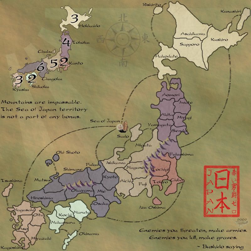
I think you need an icon for the Sea of Japan. It took me a while to figure out where this "territory" was and once I did I exclaimed "Duh! He had meant this bit void!". Seriously, consider putting a nice Japanese boat on it or something like this.
Keep up the good work!
Keep up the good work!
-
 eigenvector
- Posts: 95
- Joined: Tue Jul 24, 2007 4:27 am


Re: Japan - 日本 (D, Gp) V11.2 (Upd 12-6)pg38 Working on Graphics
I'm getting there... I think my border on the stamp is way to think and I'll have to work it some more. I might have to also adjust the angle of the brush for some of the connectors for a better look, the lines in the y direction are look more like notches, especially for the shorter lines. I've also darkened the background for better contrast.
The old map I liked since it was more colorful, this is more subtle with a clearer theme. I can go either way.
The old map I liked since it was more colorful, this is more subtle with a clearer theme. I can go either way.


-

 RedBaron0
- Posts: 2657
- Joined: Sun Aug 19, 2007 12:59 pm
- Location: Pennsylvania


Re: Japan - 日本 (D, Gp) V11.2 (Upd 12-6)pg38 Working on Graphics
Very Nice! 
Are you open to suggestions about bonuses and continents at these stage or is it already fixed?
Are you open to suggestions about bonuses and continents at these stage or is it already fixed?
-
 eigenvector
- Posts: 95
- Joined: Tue Jul 24, 2007 4:27 am


Re: Japan - 日本 (D, Gp) V11.2 (Upd 12-6)pg38 Working on Graphics
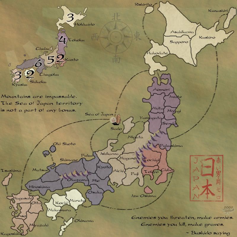
The title color. Go back to the same shade a page back. Darker. Please.
Really like the more pronounced back ground!
Really like the more pronounced back ground!
This post was made by jefjef who should be on your ignore list.


drunkmonkey wrote:I'm filing a C&A report right now. Its nice because they have a drop-down for "jefjef".
-

 jefjef
- Posts: 6026
- Joined: Mon Feb 23, 2009 8:41 pm
- Location: on my ass


Re: Japan - 日本 (D, Gp) V11.2 (Upd 12-6)pg38 Working on Graphics
I'm not sure I like the color of Shikoku...seems strangely like the odd man out color wise.
--Andy
--Andy
-

 AndyDufresne
- Posts: 24935
- Joined: Fri Mar 03, 2006 8:22 pm
- Location: A Banana Palm in Zihuatanejo


Re: Japan - 日本 (D, Gp) V11.2 (Upd 12-6)pg38 Working on Graphics
That color is an easy fix, and I'm working on the the stamp still.(with some help) I actually miss that green that used to be in Chubu... but the color blindness filter kinda nixed it and when I switched the 2 colors it didn't come out the same.


-

 RedBaron0
- Posts: 2657
- Joined: Sun Aug 19, 2007 12:59 pm
- Location: Pennsylvania


Re: Japan - 日本 (D, Gp) V11.2 (Upd 12-6)pg38 Working on Graphics
eer, I don't like the font you're using. Can you try these free type fonts?


You can get them in dafont


You can get them in dafont
-

 fumandomuerte
- Posts: 620
- Joined: Sat Dec 29, 2007 1:27 am
- Location: The Cinderella of the Pacific


Re: Japan - 日本 (D, Gp) V11.4 (Upd 12-8)pg38 Working on Graphics
I'll likely make a push here and see if I can't get into the Forge by the weekend, but I'm content to wait too. killing.44 graciously offered to help me with the title block and here's what he's come up with. I'm pretty beat and will give those fonts a try in the morning.


-

 RedBaron0
- Posts: 2657
- Joined: Sun Aug 19, 2007 12:59 pm
- Location: Pennsylvania


Who is online
Users browsing this forum: No registered users

