benny profane wrote:i'm not into the fixed starting points.
doesn't seem to have anything to do with the idea...
in AoM it makes sense, but on this map it would feel like a gimmick.
Oasis [Quenched]
Moderator: Cartographers
![]() by sfhbballnut on Mon Feb 18, 2008 3:56 pm
by sfhbballnut on Mon Feb 18, 2008 3:56 pm
-
 sfhbballnut
- Posts: 1687
- Joined: Fri May 05, 2006 3:01 pm


![]() by TaCktiX on Mon Feb 18, 2008 6:34 pm
by TaCktiX on Mon Feb 18, 2008 6:34 pm
I love the idea for the map, I would certainly want to play on it. I agree with your own later idea to increase the number of fertile territories, allowing for an opponent to build up a base of operations before charging forward. Because of the decay, not allowing people to have a decent starting amount of territory just wouldn't be fair and would leave too much up to luck.
-

TaCktiX
- Posts: 2392
- Joined: Mon Dec 17, 2007 8:24 pm
- Location: Rapid City, SD


![]() by wcaclimbing on Mon Feb 18, 2008 9:24 pm
by wcaclimbing on Mon Feb 18, 2008 9:24 pm
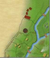
Like I promised, here is a small example of the graphics of my next update.
notes:
---that is taken from what will become the large version. small will be shrunk a bit.
---The Fertile land will have a bunch of houses and villages and manmade stuff, along with some water and plants and nature effects. the desert will be mostly empty. The Oases will be about the same as the fertile land, except there won't be any manmade structures. just nature.
---thats the bottom right corner of the map.
---I haven't drawn in most of the borders yet.
---that image isn't finished. i need to do some touchups in a few places (fix the yellow roofs, make the rocks more visible, etc.)

-

wcaclimbing
- Posts: 5598
- Joined: Fri May 12, 2006 10:09 pm
- Location: In your quantum box....Maybe.


![]() by whitestazn88 on Mon Feb 18, 2008 10:58 pm
by whitestazn88 on Mon Feb 18, 2008 10:58 pm
thanks for the image update, looks sweet.
but what about the gameplay?
but what about the gameplay?
-
whitestazn88
- Posts: 3128
- Joined: Mon Feb 05, 2007 2:59 pm
- Location: behind you


![]() by gimil on Mon Feb 18, 2008 11:07 pm
by gimil on Mon Feb 18, 2008 11:07 pm
whitestazn88 wrote:thanks for the image update, looks sweet.
but what about the gameplay?
He mentioned it was jsut a graphical sample and that me was still worknig on the complete image . . .
What do you know about map making, bitch?
Top Score:2403
natty_dread wrote:I was wrong
Top Score:2403
-

gimil
- Posts: 8599
- Joined: Sat Mar 03, 2007 12:42 pm
- Location: United Kingdom (Scotland)


![]() by wcaclimbing on Mon Feb 18, 2008 11:18 pm
by wcaclimbing on Mon Feb 18, 2008 11:18 pm
whitestazn88 wrote:thanks for the image update, looks sweet.
but what about the gameplay?
gameplays all in the desert. The Fertile land doesn't matter very much, its just the starting place for your race to the Grand Oasis.
I'm getting all of the fertile land out of the way now, because its pretty easy and not that big of a deal where the countries go. If any of the borders do need to be changed, it will be very easy to do. I can just re-draw them wherever (which is why there aren't any names on the map yet. Names will be added once the terrain is finished, because I won't know where to put them until the villages and plants and water are all painted in.)
Oh, and about the number of countries:
I finished drawing in the borders for the fertile area on the right side of the map. It is about equal in size to the fertile area on the image in my first post, but instead of the 10 countries there in the first draft, there are now 21.
The countries will be packed much tighter, but it will still work well and look good (see my preview on page 3. the size of the countries in that image is about the same as the rest of the map.) The benefit of small countries is that once I begin developing the desert, i will be able to put a ton of countries in there and really make it the scale I am imagining it to be. It wouldn't suprise me if there ends up being around 80 countries within the desert. Deserts are big and mostly empty. that is the feel I am going for. Lots of space to travel and move around, and lots of oases to help build up your bonuses.
-
wcaclimbing
- Posts: 5598
- Joined: Fri May 12, 2006 10:09 pm
- Location: In your quantum box....Maybe.

![]() by militant on Tue Feb 19, 2008 11:38 am
by militant on Tue Feb 19, 2008 11:38 am
The graphics are looking great, but i dont know if it is a good idea to have som many territories because there has been a lot of demand for small maps, and i know it is our map and you have a vision of what it should be like, but i think you should consider none of the less. But the graphica are looking awesome.
Guys I am intentionally lurking. Discuss; Play mafia, it is good.
Oderint Dum Metuant says: Don't confuse the easily confused!
Oderint Dum Metuant says: Don't confuse the easily confused!
-

militant
- Posts: 923
- Joined: Mon Jul 30, 2007 1:25 pm
- Location: Playing Mafia


![]() by gimil on Tue Feb 19, 2008 12:21 pm
by gimil on Tue Feb 19, 2008 12:21 pm
militant wrote:The graphics are looking great, but i dont know if it is a good idea to have som many territories because there has been a lot of demand for small maps, and i know it is our map and you have a vision of what it should be like, but i think you should consider none of the less. But the graphica are looking awesome.
Just because there is a demand for small maps doesnt mean the foundry have to provide . . .
Cartographers have maps for there enjoyment and to create something they want to paly on. If lack wants to plug the demand for certain types of maps he can gladly higher someone to do it
What do you know about map making, bitch?
Top Score:2403
natty_dread wrote:I was wrong
Top Score:2403
-
gimil
- Posts: 8599
- Joined: Sat Mar 03, 2007 12:42 pm
- Location: United Kingdom (Scotland)
![]() by wcaclimbing on Tue Feb 19, 2008 12:58 pm
by wcaclimbing on Tue Feb 19, 2008 12:58 pm
ok guys, heres a bit more of the image.
Its my new signature banner.
The area in the picture is the entire right fertile land (but it is rotated 90 degrees so it can fit).
I will be adding a few more details in, but thats basically it.
If you turn your head to the side and try to ignore the huge Title i put on the picture, you can see what it will look like.
There still aren't any borders drawn in the desert yet, and one country (top left of the image) got completely cut off because i couldn't fit it all into the sig.
If you are wondering what the big dirty brown-ish circle in the middle is, just think of it as some kind of animal pen, with sheep or cows or something inside it.
-
wcaclimbing
- Posts: 5598
- Joined: Fri May 12, 2006 10:09 pm
- Location: In your quantum box....Maybe.
![]() by wcaclimbing on Tue Feb 19, 2008 4:58 pm
by wcaclimbing on Tue Feb 19, 2008 4:58 pm
NEW IMAGE!
I labeled it V1.5 cause its not finished yet. V2 will be up in a few days.
Excuse all the extra writing I painted on. I didn't want any "why is ____ not colored?". Its not finished, except for the parts that the blue is pointing at. All of the right fertile land and the Key.
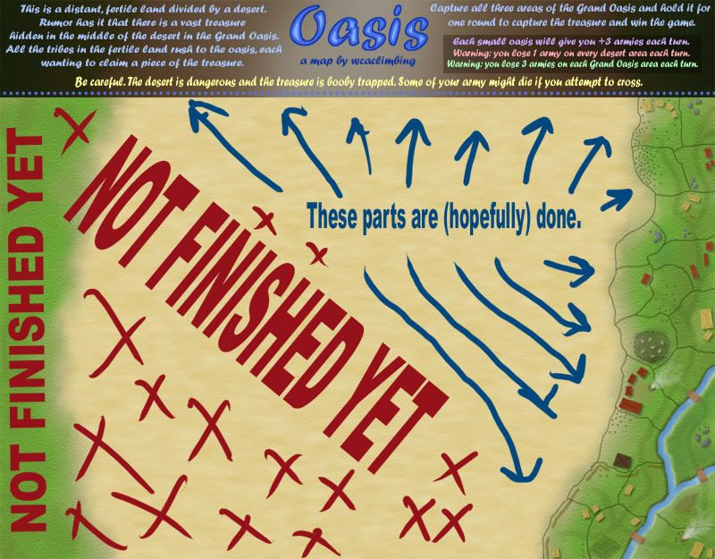
Please comment. I really have no idea if this is a good or bad map key....
and comment on the rest of the finished stuff, if you want to.
I labeled it V1.5 cause its not finished yet. V2 will be up in a few days.
Excuse all the extra writing I painted on. I didn't want any "why is ____ not colored?". Its not finished, except for the parts that the blue is pointing at. All of the right fertile land and the Key.
Please comment. I really have no idea if this is a good or bad map key....
and comment on the rest of the finished stuff, if you want to.
-
wcaclimbing
- Posts: 5598
- Joined: Fri May 12, 2006 10:09 pm
- Location: In your quantum box....Maybe.
![]() by Incandenza on Tue Feb 19, 2008 5:20 pm
by Incandenza on Tue Feb 19, 2008 5:20 pm
Nice looking map, wca. It's got that troy feel to it (and since troy is one of the maps I most wish has actually been quenched, that's a good thing).
I do have one issue at present: the font used in the title bar is weird, the 'h's are really oddly shaped and kinda look like 'a's. If you could look for an alternative or two, that would be awesome.
I'm looking forward to seeing the rest of the map and the country breakdown.
I do have one issue at present: the font used in the title bar is weird, the 'h's are really oddly shaped and kinda look like 'a's. If you could look for an alternative or two, that would be awesome.
I'm looking forward to seeing the rest of the map and the country breakdown.
THOTA: dingdingdingdingdingdingBOOM
Te Occidere Possunt Sed Te Edere Non Possunt Nefas Est
Te Occidere Possunt Sed Te Edere Non Possunt Nefas Est
-

Incandenza
- Posts: 4949
- Joined: Thu Oct 19, 2006 5:34 pm
- Location: Playing Eschaton with a bucket of old tennis balls


![]() by whitestazn88 on Tue Feb 19, 2008 6:31 pm
by whitestazn88 on Tue Feb 19, 2008 6:31 pm
Incandenza wrote:Nice looking map, wca. It's got that troy feel to it (and since troy is one of the maps I most wish has actually been quenched, that's a good thing).
I do have one issue at present: the font used in the title bar is weird, the 'h's are really oddly shaped and kinda look like 'a's. If you could look for an alternative or two, that would be awesome.
I'm looking forward to seeing the rest of the map and the country breakdown.
he stole exactly what i was gonna say. the legend/key is very hard to read. i had to look at it almost 3 times before i could fully realize what i was seeing.
the image looks amazing so far
what is the deal with territory bonuses on this map, as i know a lot of newer ones are featuring things like, no territ bonus, or +1 per 2, or whatever it may be. maybe a little clarification?
-
whitestazn88
- Posts: 3128
- Joined: Mon Feb 05, 2007 2:59 pm
- Location: behind you
![]() by wcaclimbing on Tue Feb 19, 2008 6:44 pm
by wcaclimbing on Tue Feb 19, 2008 6:44 pm
whitestazn88 wrote:Incandenza wrote:Nice looking map, wca. It's got that troy feel to it (and since troy is one of the maps I most wish has actually been quenched, that's a good thing).
I do have one issue at present: the font used in the title bar is weird, the 'h's are really oddly shaped and kinda look like 'a's. If you could look for an alternative or two, that would be awesome.
I'm looking forward to seeing the rest of the map and the country breakdown.
he stole exactly what i was gonna say. the legend/key is very hard to read. i had to look at it almost 3 times before i could fully realize what i was seeing.
the image looks amazing so far
what is the deal with territory bonuses on this map, as i know a lot of newer ones are featuring things like, no territ bonus, or +1 per 2, or whatever it may be. maybe a little clarification?
The purple text on the key are all the bonuses there are. +3 for each oasis held. There will be a lot of oases on the map, so there will be plenty of chances to get a lot of armies.
I changed the text on the key, and its a bit easier to read. You will see it on the next update.
-
wcaclimbing
- Posts: 5598
- Joined: Fri May 12, 2006 10:09 pm
- Location: In your quantum box....Maybe.
![]() by benny profane on Tue Feb 19, 2008 8:03 pm
by benny profane on Tue Feb 19, 2008 8:03 pm
the image so far looks GREAT.
i agree that a better font is needed.
am i correct in assuming there won't be any bonuses for the green borderlands?
i agree that a better font is needed.
am i correct in assuming there won't be any bonuses for the green borderlands?
-

benny profane
- Posts: 248
- Joined: Sat Jun 16, 2007 4:00 pm
- Location: Brooklyn, NY


![]() by Grooveman2007 on Tue Feb 19, 2008 8:52 pm
by Grooveman2007 on Tue Feb 19, 2008 8:52 pm
I like the villages on the edges.
The big trouble with dumb bastards is that they are too dumb to believe there is such a thing as being smart.
-Kurt Vonnegut
-Kurt Vonnegut
-
Grooveman2007
- Posts: 333
- Joined: Wed Oct 31, 2007 7:08 pm
- Location: Minnesota
![]() by baggins994 on Tue Feb 19, 2008 10:00 pm
by baggins994 on Tue Feb 19, 2008 10:00 pm
i think its great but they're right about the top
i look foreward to the finished work
i look foreward to the finished work
"In a time of universal deceit, telling the truth becomes a revolutionary act." -- George Orwell

linkspot.weebly.com
^^ Go Here!!! Plz!!^^
Highest Rank/Score: Sergeant 1430
linkspot.weebly.com
^^ Go Here!!! Plz!!^^
Highest Rank/Score: Sergeant 1430
-

baggins994
- Posts: 438
- Joined: Tue May 01, 2007 2:31 pm
![]() by Emperor_Metalman on Tue Feb 19, 2008 10:08 pm
by Emperor_Metalman on Tue Feb 19, 2008 10:08 pm
I really like this map.
However, varying the number of territories and bonuses of the oases would make this map more interesting. Also, I'm concerned that some players may have to deal with a signficantly inferior territory drop.
However, varying the number of territories and bonuses of the oases would make this map more interesting. Also, I'm concerned that some players may have to deal with a signficantly inferior territory drop.
-
Emperor_Metalman
- Posts: 78
- Joined: Fri May 25, 2007 5:45 pm


![]() by gimil on Wed Feb 20, 2008 11:26 am
by gimil on Wed Feb 20, 2008 11:26 am
I think weve heard enought about hte legends 
Lets give him time to make an update then we can bitch about it some more
Lets give him time to make an update then we can bitch about it some more
What do you know about map making, bitch?
Top Score:2403
natty_dread wrote:I was wrong
Top Score:2403
-
gimil
- Posts: 8599
- Joined: Sat Mar 03, 2007 12:42 pm
- Location: United Kingdom (Scotland)
Who is online
Users browsing this forum: No registered users
|
|||||||
| Conquer Club is not associated with RISK online in any way. Copyright © 2006-2025 by Big Wham LLC | |||||||